
SIGNALROOM
Find the why.
A software story built around a familiar question: with so many requests, what should we build? One message becomes a connected campaign about finding the problem behind the ask.
01 / The hero film · 22 seconds
A request isn’t a reason.
“Add a setup video?” sounds like a task ready to build. We follow that message into SIGNALROOM, connect three customer excerpts, and reveal a shared difficulty: people do not know where to start. The proposed task changes to a guided setup checklist, with the evidence still attached.
- The audience
- Product and design teams making sense of customer feedback.
- The objective
- Make the product’s value visible through one understandable decision.
- The organizing idea
- Find the underlying problem before committing to a proposed solution.
Why this story
Show a change in thinking.
A feature tour can show what an interface contains without explaining why someone needs it. We chose a smaller story with a visible before and after: a requested video becomes a proposed checklist once the customer problem is understood.
The change is a proposal for the team to review. Keeping the source excerpts connected makes the reasoning visible instead of presenting the software as an unexplained answer machine.
The static campaign
Three ways into the same idea.
Each execution has a different job: name the frustration, explain the mechanism, or make the benefit concrete. The compositions were designed for still-image reading.
02 / Name the problem
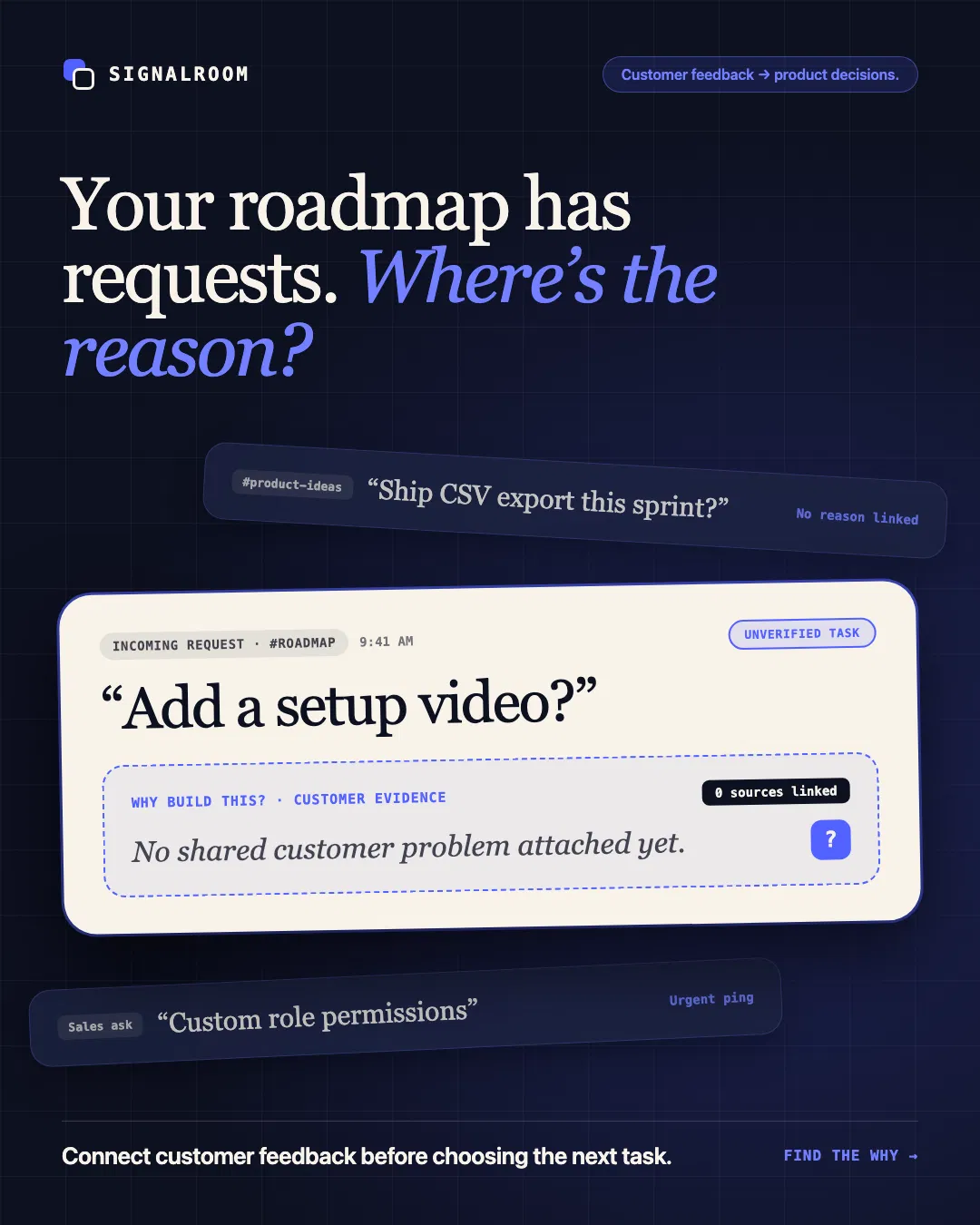
Your roadmap has requests. Where’s the reason?
Why we made it this way
The request stack makes roadmap pressure visible. One large, unresolved evidence field gives that pressure a specific meaning: the team has ideas, but the reason to build them is missing. The dark field and off-axis strips create tension while the ivory task holds attention.
03 / Explain the mechanism
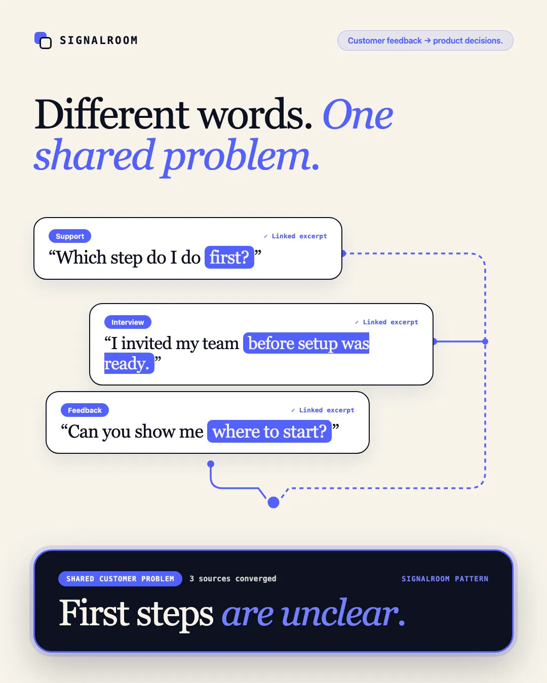
Different words. One shared problem.
Why we made it this way
The three excerpts use different language for a related difficulty. Blue highlights isolate the useful phrases, and the connecting paths make their relationship legible in a single still. The larger diagnosis gives the viewer somewhere to land. This execution explains the product rather than repeating the film’s opening.
04 / Make the benefit concrete
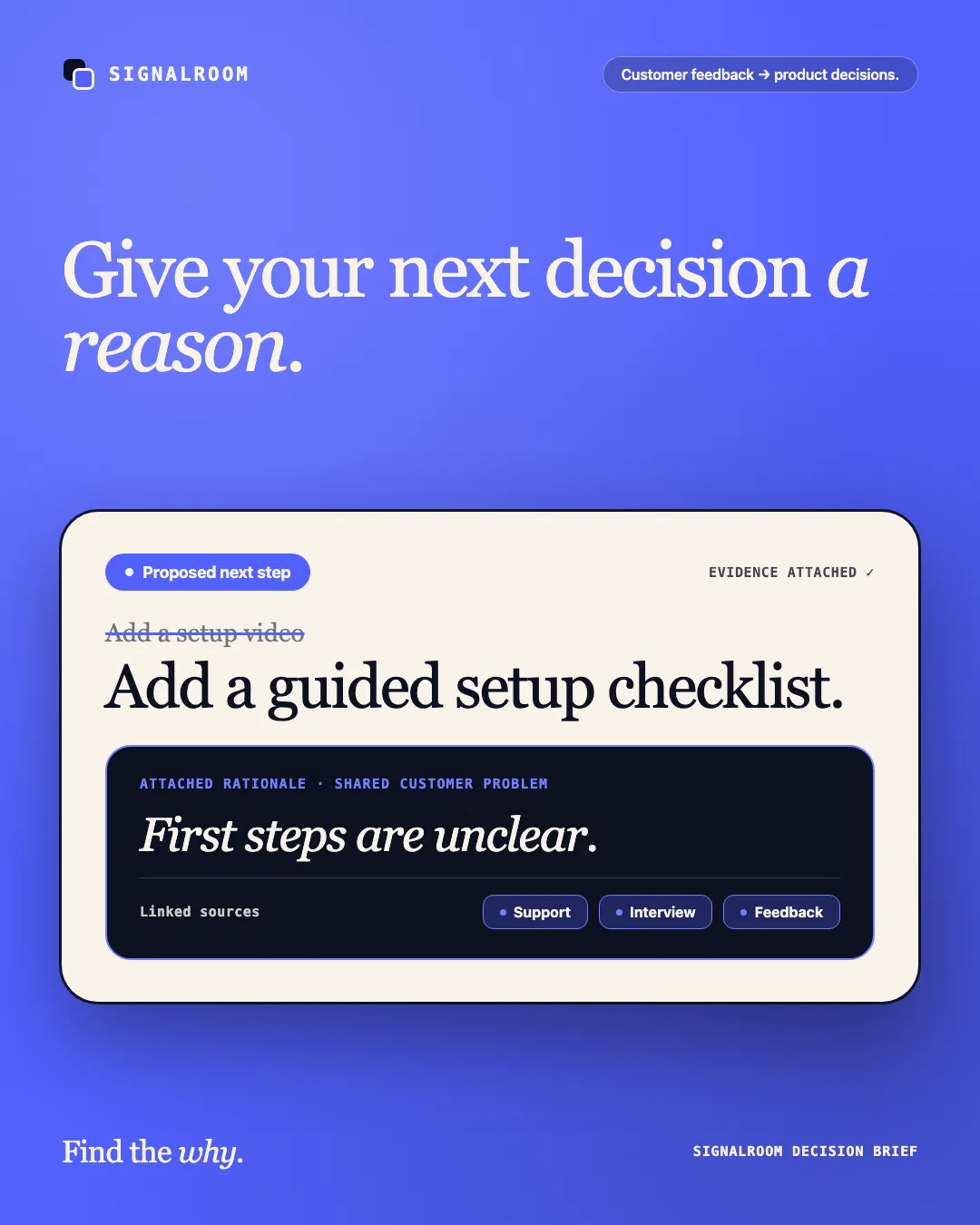
Give your next decision a reason.
Why we made it this way
The task, rationale, and sources form one connected artifact. Changing a vague implementation request into a proposed checklist makes the decision tangible. An electric-blue field gives this resolution a more assertive tone, while the ivory surface keeps the interface readable.
05 / The alternate opening · 15 seconds
Enter through the decision.
The shorter edit opens directly on “What should we build next?” and the proposed video request. Two customer excerpts carry the evidence sequence, leaving room for the shared problem and task revision to remain readable. The timing and sound cues were re-edited for the shorter story.
The new opening gives the campaign a second entry point while the same interface, evidence, and visual identity keep it connected to the hero film.
The visual system
Make the reasoning move.
The sent message stays recognizable as it enters the product. Highlighted phrases become linked evidence; the task remains editable. These shared objects carry the viewer between scenes, giving the transitions a narrative purpose.
Deep ink sets the context, warm ivory gives the evidence a clear reading surface, and electric blue marks the moment the pattern becomes visible. Expressive serif type and compact interface controls balance personality with product clarity.
VERIDVA’s role
Campaign concept, script, interface art direction, motion design, static design, editing, and sound direction through an AI-assisted production workflow.
The campaign set
A 22-second vertical hero film, a 15-second alternate-opening cutdown, and three 4:5 static ads connected by one message and visual identity.
Give your product a story people can follow.
Start a creative test